This tutorial has a file for you to help you follow along. It can be found here. The file size
is about 112 KB, no worries ^^
Before you begin, please note that this tutorial requires you to have basic knowledge of Photoshop and a little patience. Great skill does not come right away, so don't get frustrated with yourself if your results aren't as good as mine (though they'll probably be better, ehehe ^^;). By the end of this tutorial, you'll have lineart that's ready to color, which is a separate tutorial. Anyways, since I'm wasting my Spring Break doing this, I hope you enjoy.
Any questions, please ask! E-mail me.
-L-chan
 Step 1
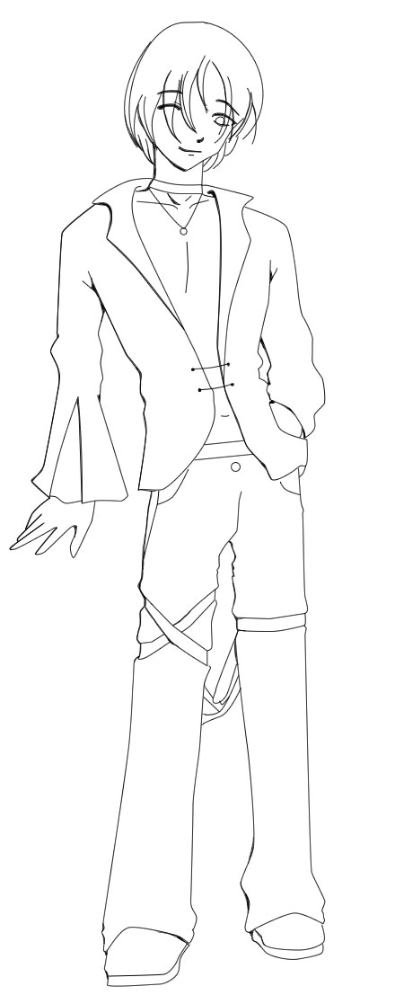
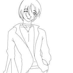
Right, so you have this picture that I doodled during AP History class with odd comments and anatomical errors galore. O.o; Anyways, normally we'd make the sketch a bit easier to see, but I've already done that for you. Hit Ctrl+Shift+L to auto-fix the levels, or Ctrl+L if you want to do it by hand. Next, create two more layers. Press "D" for default colors, click on the layer above your background layer, and press Ctrl+Backspace to fill it with white. Name it "white" or something, and then name the layer on top of that "lineart". We'll be toggling the white layer on and off during our project, so just turn it off for now.
 Step 2
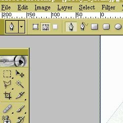
Select the pen tool, and make sure the bar on top has these settings. We don't want odd things to be happening...also, set the brush tool to 1px, and make sure the flow and opacity are both at 100%.
 Step 3
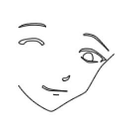
Zoom in a bit and select the pen tool (p). Make sure you're on the lineart layer, and click at the places where his face changes direction the most. Don't worry about making it look smooth, just make it look something like what I have to the right.
 Step 4
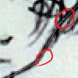
Now's the part where we make it look smooth. With the pen tool selected, hold down "alt" on your keyboard and click and drag on an anchor point with your mouse. You'll get little lines that stick off of the anchor point that control which way the line curves. To create an anchor point, click on the line. To move an anchor point, hold down Ctrl and click and drag. To subtract an anchor point, simply click on it. (Am I going to fast? This pen tool tutorial will take you through the basics a bit slower) When you've got the line looking like what you want it to, hold down ctrl and click off the line somewhere. Now, you're free to start a new line.
 Step 5
Speaking of next, where do we start? Usually I finish the facial features after the outline of the face, so let's go there next. Since lines without varying thickness are just a bit too boring to be used on the face, I've created shapes with the pen tool. When you're done with these lines, give them curves like we did in the previous step.
 Step 6
It's time to stroke the the path we've created! ^^ To do this, check to make sure your lineart layer is selected again and that the brush tool is set on 1px, then select your pen tool (p), right-click, and hit "stroke path". Pull the brush tool up in the "Tool" window and make sure that "Simulate Pressure" is not checked. Ta-da! Lines stoked. Select the pen tool again and hit 'delete' on your keyboard to get rid of those annoying lines. Toggle the white layer on and you'll see what it looks like...pretty good, eh? If you're going for the multiple-line-width thing like I am, you'll need to do the next step. If not, skip on to Step 8.
 Step 7
We need to fill in those gaps between the lines so he doesn't look odd later on O.o; Select the brush tool and zoom in a bit. Color the space in between the lines- make sure you're doing it on the lineart layer! You should have something like this when you're done.
 Step 8
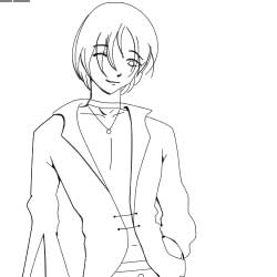
Now that you've learned the basics, go on and finish the rest of his body. If you're doing the line thickness steps, be sure to see Step 9 as well. If not, feel free to skip it. After this step, you're done!
...And since I have this odd hatred for doing lineart, I tend to do as little of it as possible, hence the lack of wrinkles (I love to color, X.X). You might want to trace over them anyways, just to make the picture look more complete.
 Extra- Step 9
Now it's time to play with line thickness a bit more (or at least for those of you who are choosing this option)! There's not a really right way for doing this (or anything else art-related, for that matter), so just put them in where you like them. Add a second line near the original one and color in the space between, just like we did above. The eraser tool might be handy for having things taper off.