Step1: Open a new document file in your Photoshop (7, in this case) and set dimensions to 500x500. We don't need background, but if you want to work on it as a layer, then go ahead and double click on it, so the window will pop out and ask you if you want to make it a layer... click 'OK'. First, we need a layer filled with black (edit>fill>black). Then set it to 'screen' mode.
Step2: Make sure your foreground color palette(the color with which you draw) is set to white. Select your brush and then click on 'brushes' options window  . Scroll down and select the 'starbrurst-small'
 and make the spacing 1% (I'd say 0, but 1 is as far as it gets) in 'brush tip shape' option. After that, click on 'texture' option and just make it look as follows:
 Then set your brush 'Flow' to 17%. **IMPORTANT**
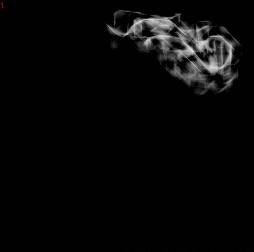 Step3 (where the fun starts): Just play around... make some shapes and what-not. Try to give rich texture and if needed, lower your brush flow and the make some more strokes. Also, don't go over border and don't smudge all over the place... we only need like 1/5 of it on the layer.
 After that, go to filter>liquify (I know you're going to love liquify after this). Again, play around. Play with settings to get comfortable with this filter and make form. The only suggestion I could give is try to smudge only from the edge of strokes, if the pressure is high. Be gentle, we need texture, not senseless lines.
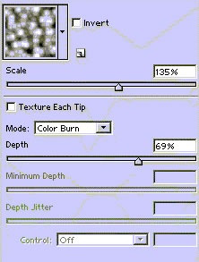
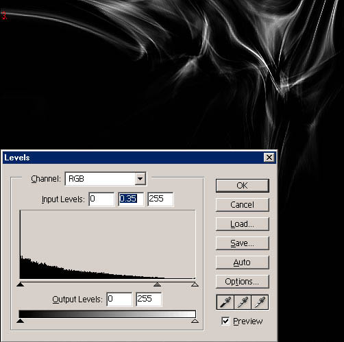 When you're done with above stated, go to filter>sharpen>sharpen more and then again but this time filter>sharpen>sharpen. After that, open up 'levels' window- you can open it with image>adjustments>levels or you can just press ctrl + L (for pc users). Look at the image to the right for a settings reference.
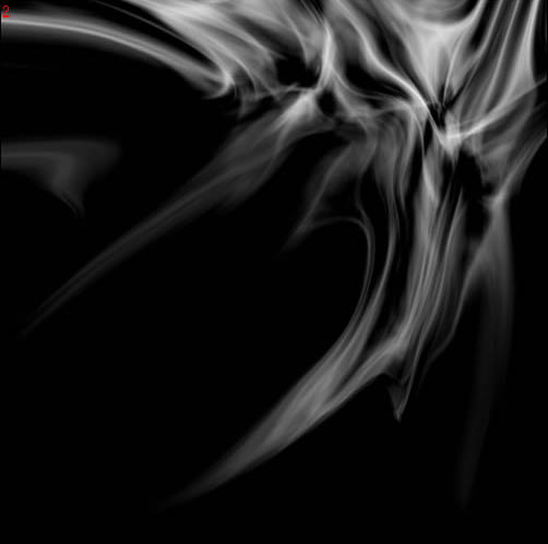
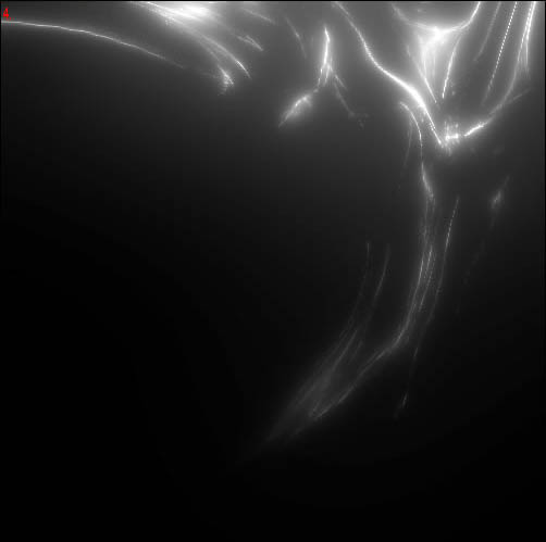 After we got that cheesy looking shape, go to filter>blur>gaussian blur and enter 10.0. Then go to the 'fade' window (edit>fade... or ctrl + shift + F), and in the window appear that appeared, set the blend mode to 'lighten'. Repeat same thing but with gaussian blur on 60, 85, 6, 3, 1.5, and finally 15, faded with the 'linear dodge' blend mode.
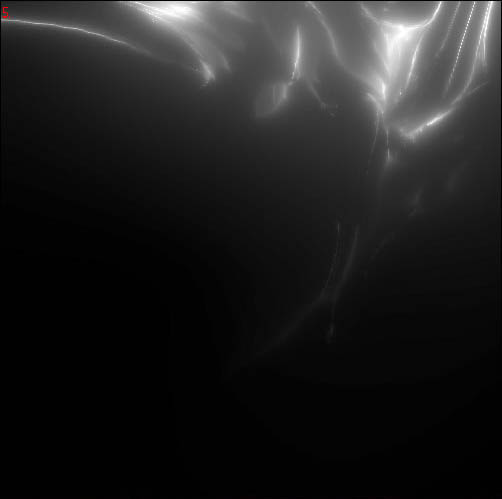 Now we're almost done, unless you're already satisfied with the result... Now, for the sake of insanity, do filter>distort>pinch and fade it with 'darken' mode. It adds a nice touch, I think... well, for MY version, anyway. This is the part where 'playing around' plays the biggest role, I think.
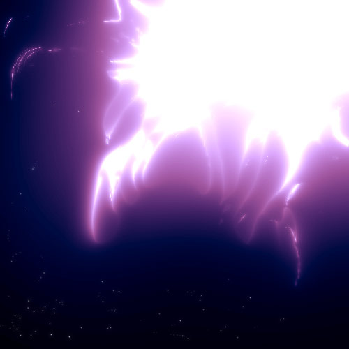
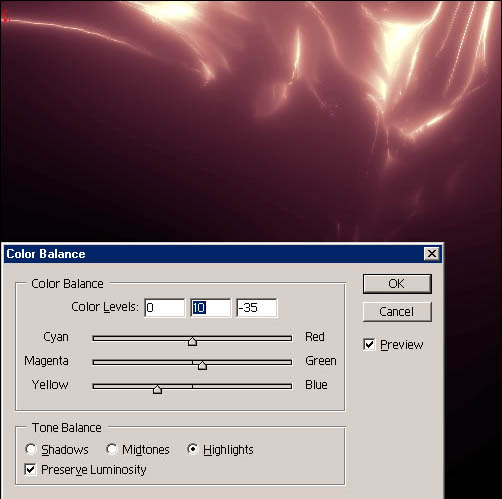 Step3: Now for coloring part, if you like colors. Go to image>adjustments>hue/saturation or just ctrl + U. Check the 'colorize' box and use these settings: hue-20, saturation-25, brightness-0. After that, go to image>adjustments>color balance or ctrl + B and enter the following values (make sure 'preserve luminosity' is checked): midtones-magenta-65, highlights-yellow-35, and highlights-green-10 (just move arrow to the direction of color indicated). Big place for color experimentation.
And we're done. Coloring is the last part of any project, I think. And remember, good abstract lights aren't made of just 1 layer. Also, experimentexperimentexperiment! ;) If you have any questions don't hesitate to PM me, if you're seeing this on a forum, or email me at 0_o@rock.com, if you're viewing this on a site.
Cheers, -Trance.